Displaying spatial data on maps is always interesting but most Visualisation tools do not offer facilities to create maps of India, especially at the state and lower levels. In this post, we will show how such maps can be made.
The base data for such maps, the "polygons" that define the country, the states, the districts and even the talukas ( or sub-divisions) is available from an organisation called
Global Administrative Areas or gadm.org.
Country level files for almost all countries are available in a variety of formats including R and these are at three different levels. For India, these files can be downloaded as IND_admN.RData where N = 1,2,3. These will form the raw data from which we will create our maps.
Working with R, we will need two R packages :
# Load required libraries
library(sp)
library(RColorBrewer)
Assuming that the downloaded RData file is located in the R working directory, the following code will generate a basic India showing the states
# load level 1 india data downloaded from http://gadm.org/country
load("IND_adm1.RData")
ind1 = gadm
# simple map of India with states drawn
#
unfortunately, Kashmir will get truncated
spplot(ind1, "NAME_1", scales=list(draw=T), colorkey=F, main="India")
Now suppose there is some data ( economic, demographic or whatever ...) and we wish to colour each state with a colour that represents this data. We simulate this scenario by assigning a random number ( between 0 and 1) to each state and then defining the RGB colour of this region with a very simple function that converts the data into a colour value. [ This idea borrowed from
gis.stackexchange ]
# map of India with states coloured with an arbitrary fake data
ind1$NAME_1 = as.factor(ind1$NAME_1)
ind1$fake.data = runif(length(ind1$NAME_1))
spplot(ind1,"NAME_1", col.regions=rgb(0,ind1$fake.data,0), colorkey=T, main="Indian States")
Now let us draw the map of any one state. First check the spelling of each state by listing the states:
ind1$NAME_1
and then executing these commands :
# map of West Bengal ( or any other state )
wb1 = (ind1[ind1$NAME_1=="West Bengal",])
spplot(wb1,"NAME_1", col.regions=rgb(0,0,1), main = "West Bengal, India",scales=list(draw=T), colorkey =F)
# map of Karnataka ( or any other state )
kt1 = (ind1[ind1$NAME_1=="Karnataka",])
spplot(kt1,"NAME_1", col.regions=rgb(0,1,0), main = "Karnataka, India",scales=list(draw=T), colorkey =F)
If we want to get and map district level data then we need to use the level 2 data as follows :
# load level 2 india data downloaded from http://gadm.org/country
load("IND_adm2.RData")
ind2 = gadm
and then plot the various districts as
# plotting districts of a State, in this case West Bengal
wb2 = (ind2[ind2$NAME_1=="West Bengal",])
spplot(wb2,"NAME_1", main = "West Bengal Districts", colorkey =F)
To identify each district with a beautiful colour we can use the following commands :
# colouring the districts with rainbow of colours
wb2$NAME_2 = as.factor(wb2$NAME_2)
col = rainbow(length(levels(wb2$NAME_2)))
spplot(wb2,"NAME_2", col.regions=col, colorkey=T)
As in the case of the states, we can assume that each district has some (economic or demographic) data and we wish to colour the districts according to the intensity of this data, then we can use the following code :
# colouring the districts with some simulated, fake data
wb2$NAME_2 = as.factor(wb2$NAME_2)
wb2$fake.data = runif(length(wb2$NAME_1))
spplot(wb2,"NAME_2", col.regions=rgb(0,wb2$fake.data, 0), colorkey=T)
But we can be even more clever by allocating certain shades of colour to certain ranges of data as with this code, adapted from
this website
# colouring the districts with range of colours
col_no = as.factor(as.numeric(cut(wb2$fake.data, c(0,0.2,0.4,0.6,0.8,1))))
levels(col_no) = c("<20%", "20-40%", "40-60%","60-80%", ">80%")
wb2$col_no = col_no
myPalette = brewer.pal(5,"Greens")
spplot(wb2, "col_no", col=grey(.9), col.regions=myPalette, main="District Wise Data")
To move to the district, sub-division ( or taluk) level we need to use the level three data file :
# load level 3 india data downloaded from http://gadm.org/country
load("IND_adm3.RData")
ind3 = gadm
# extracting data for West Bengal
wb3 = (ind3[ind3$NAME_1=="West Bengal",])
and then plot the subdivision or taluk level map as follows :
#plotting districts and sub-divisions / taluk
wb3$NAME_3 = as.factor(wb3$NAME_3)
col = rainbow(length(levels(wb3$NAME_3)))
spplot(wb3,"NAME_3", main = "Taluk, District - West Bengal", colorkey=T,col.regions=col,scales=list(draw=T))
Now let us get a map of the district - North 24 Parganas. Make sure that the name is spelt correctly.
# get map for "North 24 Parganas District"
wb3 = (ind3[ind3$NAME_1=="West Bengal",])
n24pgns3 = (wb3[wb3$NAME_2=="North 24 Parganas",])
spplot(n24pgns3,"NAME_3", colorkey =F, scales=list(draw=T), main = "24 Pgns (N) West Bengal")
and within North 24 Parganas district, we can go down to the Basirhat Subdivision ( Taluk) and draw the map as follows:
# now draw the map of Basirhat subdivision
# recreate North 24 Parganas data
n24pgns3 = (wb3[wb3$NAME_2=="North 24 Parganas",])
basirhat3 = (n24pgns3[n24pgns3$NAME_3=="Basirhat",])
spplot(basirhat3,"NAME_3", colorkey =F, scales=list(draw=T), main = "Basirhat,24 Pgns (N) West Bengal")
This is the highest resolution ( or lowest administrative division ) that we can go with data from gadm. However even within a map, one "zoom" into and enlarge an area by specifying the latitude and longitudes of a zoom box as shown here.
# zoomed in data
wb2 = (ind2[ind2$NAME_1=="West Bengal",])
wb2$NAME_2 = as.factor(wb2$NAME_2)
col = rainbow(length(levels(wb2$NAME_2)))
spplot(wb2,"NAME_2", col.regions=col,scales=list(draw=T),ylim=c(23.5,25),xlim=c(87,89), colorkey=T)
With this it should be possible to draw any map of India. For more comprehensive examples of such maps, please see
this page.
Here is the entire code
========================================
setwd("/home/xxx/yyy/maps")

# http://r-nold.blogspot.in/2012/08/provincial-map-using-gadm.html
# http://blog.revolutionanalytics.com/2009/10/geographic-maps-in-r.html
# http://gis.stackexchange.com/questions/80565/plotting-a-map-of-new-zealand-with-regional-boundaries-in-r
# https://ryouready.wordpress.com/2009/11/16/infomaps-using-r-visualizing-german-unemployment-rates-by-color-on-a-map/
# http://rstudio-pubs-static.s3.amazonaws.com/6772_441847b522584d1095daddc2677e4ddb.html -- comprehensive

# Load required libraries
library(sp)
library(RColorBrewer)

# load level 1 india data downloaded from http://gadm.org/country
load("IND_adm1.RData")
ind1 = gadm

# simple map of India with states drawn
# unfortunately, Kashmir will get truncated
spplot(ind1, "NAME_1", scales=list(draw=T), colorkey=F, main="India")

# map of India with states coloured with an arbitrary fake data
ind1$NAME_1 = as.factor(ind1$NAME_1)
ind1$fake.data = runif(length(ind1$NAME_1))
spplot(ind1,"NAME_1",  col.regions=rgb(0,ind1$fake.data,0), colorkey=T, main="Indian States")


# list of states avaialable
ind1$NAME_1

# map of West Bengal ( or any other state )
wb1 = (ind1[ind1$NAME_1=="West Bengal",])
spplot(wb1,"NAME_1", col.regions=rgb(0,0,1), main = "West Bengal, India",scales=list(draw=T), colorkey =F)
# map of Karnataka ( or any other state )
kt1 = (ind1[ind1$NAME_1=="Karnataka",])
spplot(kt1,"NAME_1", col.regions=rgb(0,1,0), main = "Karnataka, India",scales=list(draw=T), colorkey =F)

# --------------------------------------------------------------------------------------
# load level 2 india data downloaded from http://gadm.org/country
load("IND_adm2.RData")
ind2 = gadm

# plotting districts of a State, in this case West Bengal
wb2 = (ind2[ind2$NAME_1=="West Bengal",])
spplot(wb2,"NAME_1", main = "West Bengal Districts", colorkey =F)

# colouring the districts with some simulated, fake data
wb2$NAME_2 = as.factor(wb2$NAME_2)
wb2$fake.data = runif(length(wb2$NAME_1))
spplot(wb2,"NAME_2",  col.regions=rgb(0,wb2$fake.data, 0), colorkey=T)

# colouring the districts with rainbow of colours
# wb2$NAME_2 = as.factor(wb2$NAME_2)
col = rainbow(length(levels(wb2$NAME_2)))
spplot(wb2,"NAME_2",  col.regions=col, colorkey=T)

# colouring the districts with range of colours
col_no = as.factor(as.numeric(cut(wb2$fake.data, c(0,0.2,0.4,0.6,0.8,1))))
levels(col_no) = c("<20%", "20-40%", "40-60%","60-80%", ">80%")
wb2$col_no = col_no
myPalette = brewer.pal(5,"Greens")
spplot(wb2, "col_no", col=grey(.9), col.regions=myPalette, main="District Wise Data")

# --------------------------------------------------------------------------------------
# load level 3 india data downloaded from http://gadm.org/country
load("IND_adm3.RData")
ind3 = gadm

# extracting data for West Bengal
wb3 = (ind3[ind3$NAME_1=="West Bengal",])

#plotting districts and sub-divisions / taluk
wb3$NAME_3 = as.factor(wb3$NAME_3)
col = rainbow(length(levels(wb3$NAME_3)))
spplot(wb3,"NAME_3", main = "Taluk, District - West Bengal", colorkey=T,col.regions=col,scales=list(draw=T))

# get list of districts avaialable
wb3$NAME_2

# get map for "North 24 Parganas District"
wb3 = (ind3[ind3$NAME_1=="West Bengal",])
n24pgns3 = (wb3[wb3$NAME_2=="North 24 Parganas",])
spplot(n24pgns3,"NAME_3", colorkey =F, scales=list(draw=T), main = "24 Pgns (N) West Bengal")

n24pgns3$NAME_3 = as.factor(n24pgns3$NAME_3)
n24pgns3$fake.data = runif(length(n24pgns3$NAME_3))
spplot(n24pgns3,"NAME_3", col.regions=rgb(0, n24pgns3$fake.data, 0), colorkey=T,scales=list(draw=T))

# get map for "South 24 Parganas District"
s24pgns3 = (wb3[wb3$NAME_2=="South 24 Parganas",])
spplot(s24pgns3,"NAME_3", colorkey =F, scales=list(draw=T), main = "24 Pgns (S) West Bengal")

s24pgns3$NAME_3 = as.factor(s24pgns3$NAME_3)
s24pgns3$fake.data = runif(length(s24pgns3$NAME_3))
spplot(s24pgns3,"NAME_3", col.regions=rgb(0, s24pgns3$fake.data, 0), colorkey=T,scales=list(draw=T),main = "24 Pgns (S) West Bengal")


# get map for "Murshidabad District"
mur3 = (wb3[wb3$NAME_2=="Murshidabad",])
spplot(mur3,"NAME_3", colorkey =F, scales=list(draw=T), main = "Murshidabad West Bengal")

mur3$NAME_3 = as.factor(mur3$NAME_3)
mur3$fake.data = runif(length(mur3$NAME_3))
spplot(mur3,"NAME_3", col.regions=rgb(0,0, mur3$fake.data), colorkey=T,scales=list(draw=T),main = "Murshidabad West Bengal")

# now draw the map of Basirhat subdivision
# recreate North 24 Parganas data
n24pgns3 = (wb3[wb3$NAME_2=="North 24 Parganas",])
basirhat3 = (n24pgns3[n24pgns3$NAME_3=="Basirhat",])
spplot(basirhat3,"NAME_3", colorkey =F, scales=list(draw=T), main = "Basirhat,24 Pgns (N) West Bengal")

# now draw the map of Baharampur subdivision
# recreate Murshidabad data
mur3 = (wb3[wb3$NAME_2=="Murshidabad",])
bahar3 = (mur3[mur3$NAME_3=="Baharampur",])
spplot(bahar3,"NAME_3", colorkey =F, scales=list(draw=T), main = "Baharampur, Murshidabad, West Bengal")

# -------------------------------------------------------------------------------------------
# load level 2 india data downloaded from http://gadm.org/country
load("IND_adm2.RData")
ind2 = gadm

# plotting selected districts of a State, in this case West Bengal
wb2 = (ind2[ind2$NAME_1=="West Bengal",])
spplot(wb2,"NAME_1", main = "West Bengal Districts", scales=list(draw=T),ylim=c(23.5,25),colorkey =F)

# zoomed in data
wb2 = (ind2[ind2$NAME_1=="West Bengal",])
wb2$NAME_2 = as.factor(wb2$NAME_2)
col = rainbow(length(levels(wb2$NAME_2)))
spplot(wb2,"NAME_2",  col.regions=col,scales=list(draw=T),ylim=c(23.5,25),xlim=c(87,89), colorkey=T)
PostScript
While we have achieved much, what was missing was the ability to mark cities on the map and write the names next to the points marked. To do so, we require
- a function for geocoding place names into lon, lat values
- usage of the sp.layout option to place markers and texts on the map.
This has now been done, and you can see the three towns in West Bengal marked as follows
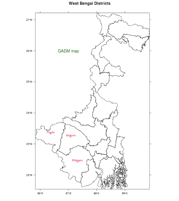
# Marking towns on the GADM maps
# On a map of West Bengal, we will now mark some towns
#
#load level 2 india data downloaded from http://gadm.org/country
#

library(ggmap) # -- for geocoding, obtaining city locations
load("IND_adm2.RData")
ind2 = gadm

# plotting districts of a State, in this case West Bengal
wb2 = (ind2[ind2$NAME_1=="West Bengal",])

nam = c("Purulia","Bankura","Midnapur")
pos = geocode(nam)
tlat = pos$lat+0.05    # -- the city name will be above the marker
cities = data.frame(nam, pos$lon,pos$lat,tlat)
names(cities)[2] = "lon"
names(cities)[3] = "lat"


text1 = list("panel.text", cities$lon, cities$tlat, cities$nam,col="red", cex = 0.75)
mark1 = list("panel.points", cities$lon, cities$lat, col="blue")
text2 = list("panel.text",87.0,26.0,"GADM map", col = "dark green", cex = 1.2)
spplot(wb2, "NAME_1",
       sp.layout=list(text1,mark1, text2),
       main="West Bengal Districts",
       colorkey=FALSE, scales=list(draw=TRUE))
to change plot symbols look at
http://www.statmethods.net/advgraphs/parameters.html


